The world today has become a small place thanks to technology and its benefits. Communication has become a very easy process, everything is at your finger tips and its mobile.
Communication is process where there is an involment of two or more parties. It could be verbal, graphical or written. Documentation plays a very vital role in todays life.
Everything should be in black and white with a string of reasons related to it like security, maintaing a record and keeping a track of things which are not possible by the brain to register everytime.
Till then books were written by hand consuming a lot of time making the work a prolonged and a tedious process. Egyptians used papyrus as papers to write down things in thier own pictorial language.
It all began in china the culture with the background of esteemed calligraphy. Moveable type machine was inveted to increase make the process more fast and precise. But chinese language with vast number of characters and few distinctive, a complete range of fonts were created in the early centuries of printing.
In the mid 1500’s johannes gensfleisch zur laden gutenberg invented a printing press where the machine was not printing itself. It used casting type pieces with reusable molds to print on paper bringing in a printing revolution to europe.
Almost 4 cneturies later, type evolved and masters were created by cutting punches. It was basically a prototype of the characters from which various type was cast by various means of especailly using alloys like lead.
Limitations like the properties of ink and the wear on the type were came across.
In the late 1800’s the american type founders corporation began drawing large scale fonts almost over a foot high. The outlines were then traced by an engraving machine with a pointer at one hand and a cutting tool at the other with a hand held vertex which used to cut down the size usually less than 6mm. Later the same machine was used to create matrices, an important factor to create fonts in todays digital world.
Principles of type designing
The term has been used in english since 1727, borrowed from glyphe (in use by french antiquaries since 1701), from the greek , glyphē, “carving,” and the verb , glýphein, “to hollow out, engrave, carve” (cognate with latin glubere “to peel” and english cleave).
Compare the carved and incised “sacred glyphs” hieroglyphs, which have had a longer history in english, dating from the first elizabethan translation of plutarch, who adopted “hieroglyphic” as a latin adjective.
The word “glyph” first came to widespread european attention with the engravings and lithographs from frederick catherwood‘s drawings of undeciphered glyphs of the maya civilization in the early 1840s.
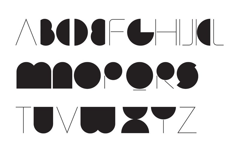
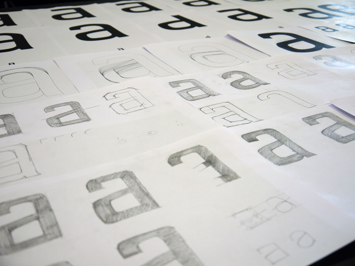
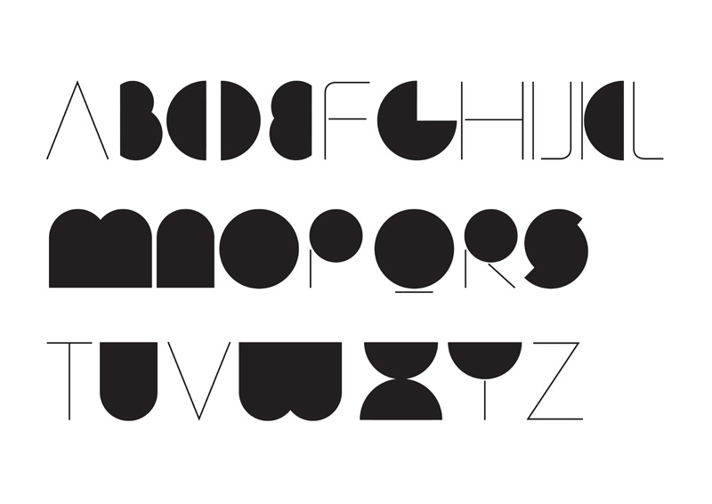
Glyphs of the same character have slightly different shapes when designed for different sizes, regardless of the method used to specify type design. This is done for artistic consistency, improved legibility, and to look more similar despite physical size differences.
Spacing is an important part of type design. Each glyph consists not only of the shape of the character, but also the white space around it.
Designing type requires many accommodations for the quirks of human perception, “optical corrections” required to make shapes look right, in ways that diverge from what might seem mathematically right. For example, round shapes need to be slightly bigger than square ones to appear “the same” size (“overshoot”), and vertical lines need to be thicker than horizontal ones to appear the same thickness.
For example, in most languages written in any variety of the latin aplhabets the dot on a lower-case i is not a glyph because it does not convey any distinction, and an i in which the dot has been accidentally omitted is still likely to be recognized correctly. In turkish, however, it is a glyph because that language has two distinct versions of the letter i,with and without a dot. Which not varies with different launguages and type face.
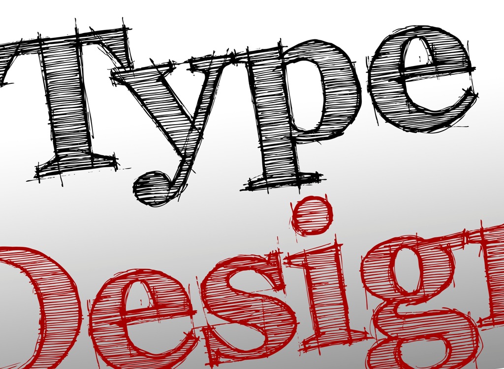
Type design is performed by a type designer. It is an art of blending elements of art and science. In the pre-digital era it was primarily learned through apprenticeship and professional training within the industry. At the same time, the transition to digital type and font editors which can be inexpensive which has led to a great democratization of type design; the craft is accessible to anyone with the interest to pursue it.
In typography, kerning (less commonly mortising) is the process of adjusting the spacing between characters in aproportional font, usually to achieve a visually pleasing result. Kerning adjusts the space between individual letter forms, while tracking (letter-spacing) adjusts spacing uniformly over a range of characters.[1] in a well-kerned font, the two-dimensional blank spaces between each pair of characters all have a visually similar area.
There are basic 17 fonts in type designing which are mentioned below
- Old style
- Transitional
- Neoclassical & didone
- Slab
- Clarendon
- Glyphic
- Formal
- Casual
- Calligraphic
- Blackletter & lombardic
- Grotesque
- Square
- Humanistic
- Geometric
- Grunge
- Psychedelic
- Graffiti
…… rest depends on the creativity of the designers and their imaginations.